
The Controversial Case for AMP Stories
Much has been said about AMP, the Accelerated Mobile Pages project spearheaded by Google, both glowingly for and bitterly against. Whatever your personal take is, though, Google is doubling down on pushing AMP in all of their properties, from AMP-powered Gmail that other providers will have no choice but to support, to a bevy of new SERP features aimed at making search results more than just a list of links.
Enter AMP Stories, a new AMP feature that Google gives search engine priority to, right out of the gate. Before we get into what AMP Stories are, I think it’s important to first revisit what AMP is supposed to be at its core.
The Premise and Promise of AMP
Accelerated Mobile Pages is a project that asserts it’s open-web and open-source independence, though to some controversy as it’s historically primarily backed by Google employees.
The premise is simple and commendable: create an easy way for all websites to make a super-fast mobile experience that mirrors their desktop experience. This is accomplished through a strictly-controlled minimal subset of HTML called AMP HTML, along with optimized javascript and a CDN.
You don’t need AMP to make a fast, mobile-friendly website. You can make your website every bit as fast as AMP with standard tech by following best practices and building for speed optimization. If you don’t have an easy way to do this and don’t want to completely rebuild your site from scratch, though, then AMP can make a lot of sense.
Where things get dicey is when Google prioritizes AMP content in search results to such a degree that publishers are de-facto forced into using it – regardless of whether there are actually any benefits to the site or users outside of priority positioning in Google. Or whether the AMP feature is even half-implemented with any thought or consideration to real-world users, and new features are just being pushed for the sake of being new.
Enter AMP Stories.
Let Me Tell You a Story
In my opinion, the only thing worse than pushing a new feature just for the sake of pushing something new is to do so with a feature that’s at best thoughtless, and at worst user-hostile.
AMP Stories are intended to be a fast way for users to consume content in a magazine-like format, much like the “stories” features that several social media sites have had for some time. The main goal is to be a fast, intuitively “touch-first” way to consume content. Such content is then prioritized in the top of search results with nice big pictures.
In practice, AMP Stories are a glorified slideshow that’s poorly implemented, counter-intuitive to use, not accessible for everyone, and fails even Google’s own standards for speed.
Let’s talk about those failures, one by one, and then see if there’s any case for you to use AMP Stories despite them.
Intuitive Touch-first Navigation
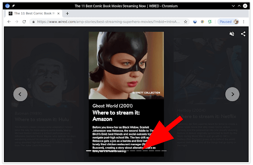
Do me a favor – take out your phone, and open this link: http://bit.ly/test-amp. That’s a real AMP Story that’s live on the internet right now, prioritized in search results.
(If you’ve used AMP Stories in the past, please pretend that you’re new to it.)
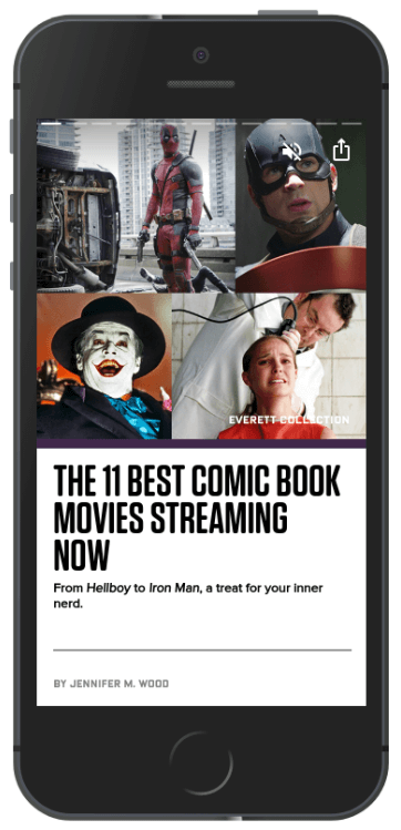
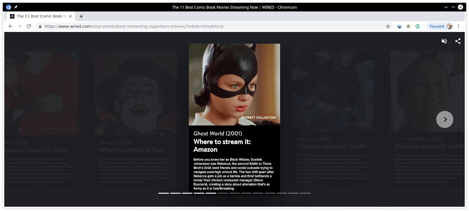
When someone clicks this link from search results, the page they land on looks a lot like any normal article or blog post – there’s a header image, a headline, a sub-heading, and the author’s byline. If you’ve never seen an AMP Story before, you might be inclined to try and scroll down with your finger.
Nope. It doesn’t work, and it yells at you:
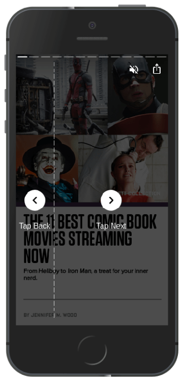
Instead of scrolling, this is actually a slideshow with a tap for next and previous slide.
Accessibility
While you’ve got that AMP Story open, maybe you want to rotate it? 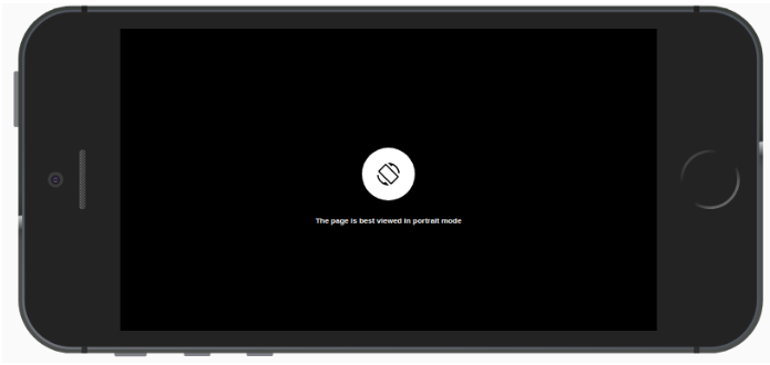 Nope. This is 2019: you hold your phone how Google tells you to hold your phone.
And no, it’s not just you – that text is extremely small and hard to read on mobile. So small, in fact, it fails Google’s own accessibility requirements for font size. Google requires that 70% of text be 14px or larger, but this page has 100% of text at just 8px. I’m honestly shocked at how little attention was spent making this page accessible for everyone. Shouldn’t this say “This page can only be viewed in portrait mode” instead of “best viewed”? This overlay does not allow any way to continue without rotating your phone back.
While we’re on the topic of things being too small, check out this tap target:
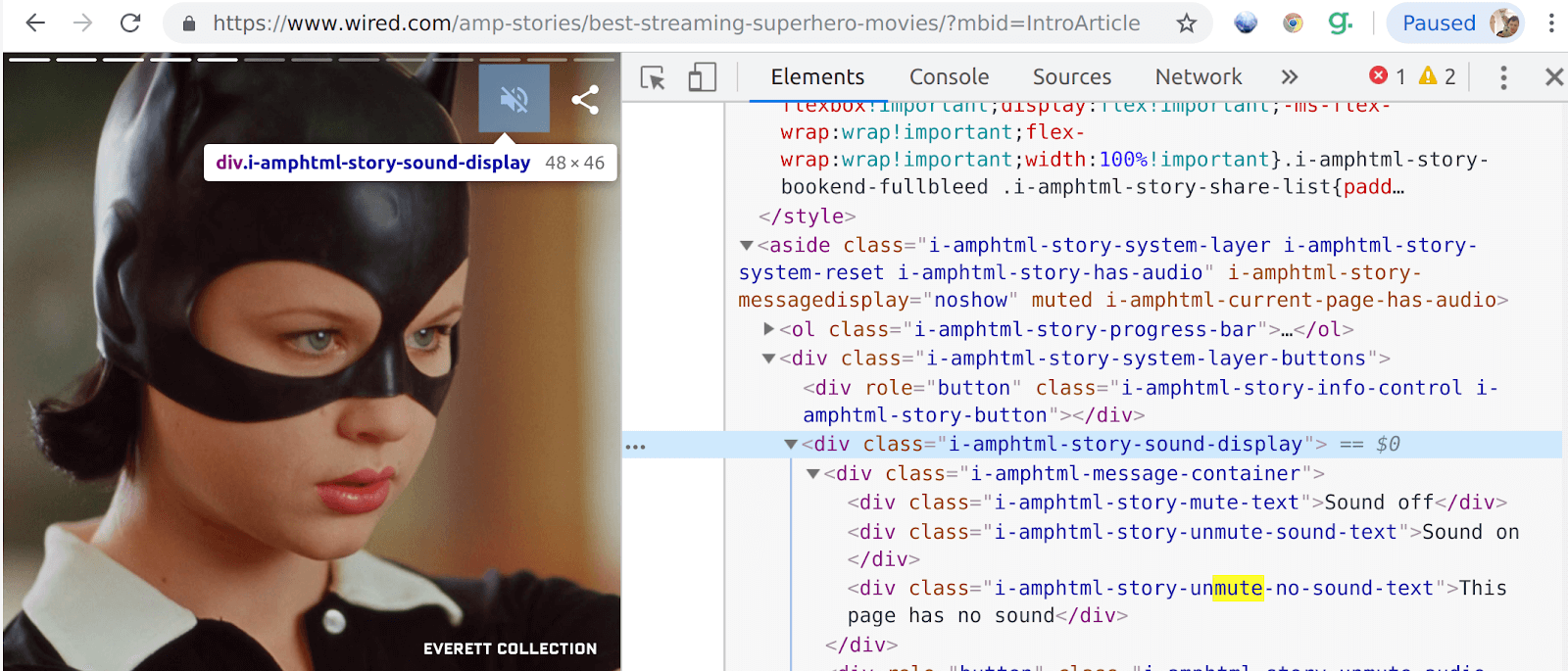
Google requires that tap targets be at bare-minimum 48×48, as a pass/fail test. This main interface tap target fails at 46×48.
Worse, if you miss that tap target, you will accidentally navigate the entire page to the next page, as the entire rest of the page is the navigation tap targets. There is no buffer, and 0 falls quite a bit short of the 8px buffer area that Google looks for.
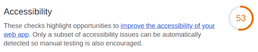
I was really surprised to see just how low Google’s own mobile testing tool, Lighthouse, graded an AMP story for accessibility:
Other items Google doesn’t like about itself include buttons not having accessible names, and images lacking alt text for screen readers.
Works on Devices Across Desktop and Mobile
So once you get the navigation of AMP Stories down, it does work as a standard slideshow on your mobile device. But what about it being a desktop experience as well?
Forcing users to use portrait mode on their phones is one thing, but taking that constrained mobile experience and just floating it in the middle of a desktop browser is hardly a desktop experience.
Trying to resize your window to more closely match the small portrait-sized AMP Story content? Nice try.
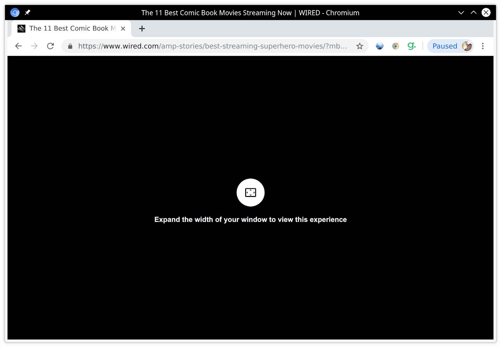
In fact, it doesn’t seem like there’s much thought put into the desktop experience at all. If you resize your window wrong, the bottom navigation will overlap and obscure the text of the story.
Oh, and while we’re at it, don’t think that your back button will work as expected to go to the previous page of the story. Instead, it takes you out of the entire AMP Story experience and back to the last actual HTML page you visited.
Fortunately for at least this item, the AMP people are aware that the desktop experience is less than ideal, and are working on it. In fact, there are now options that can work around some of these desktop issues.
Speed
Usability was never really the core promise of AMP. Mobile speed is the sole focus. With that in mind, have a look at the following screenshot:
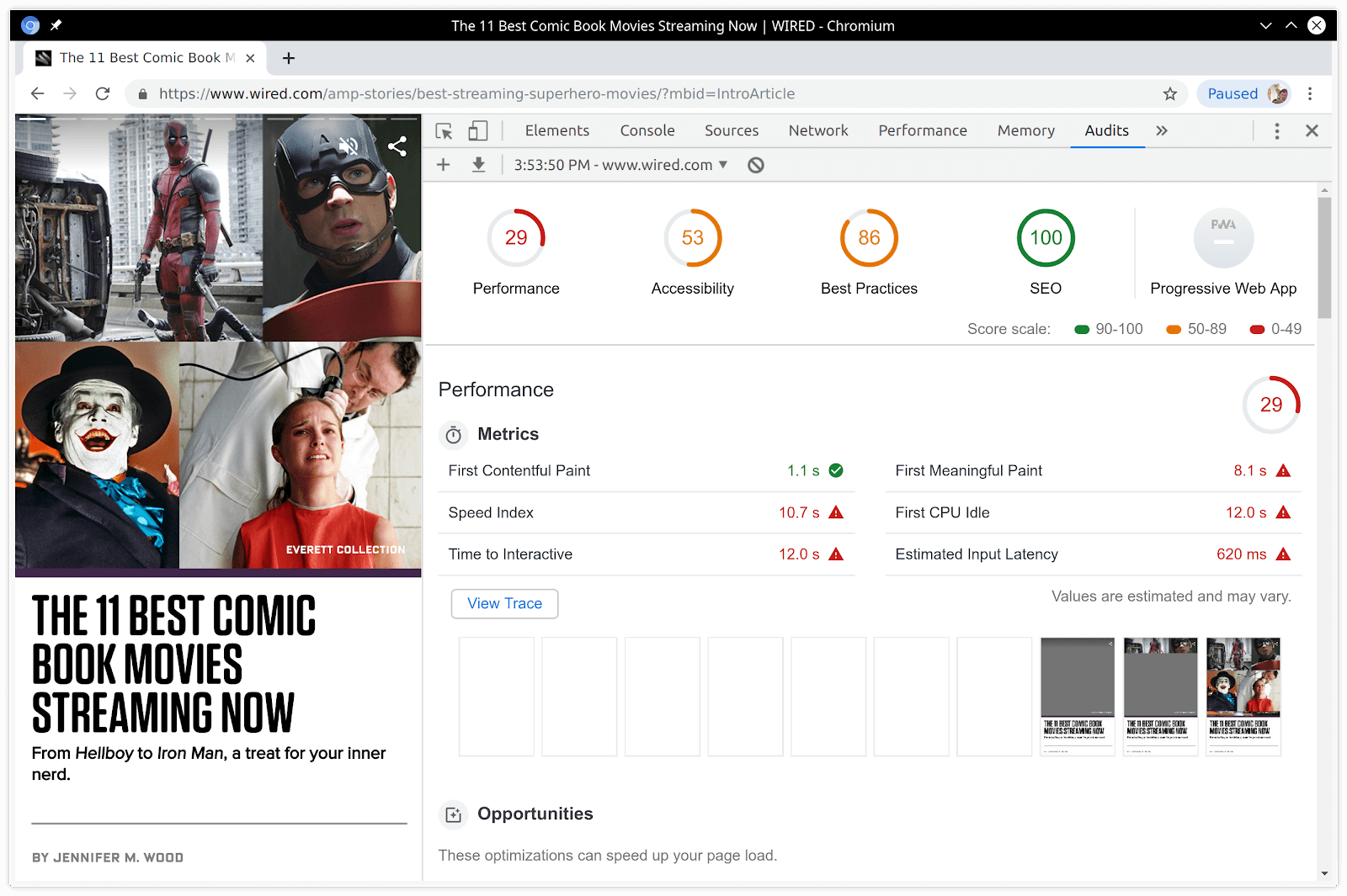
Yup, that’s the AMP Story run through Google’s own mobile testing tool, Lighthouse. Performance isn’t just bad – it’s dismal.
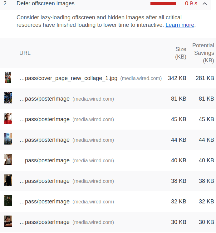
It seems like there’s no lazy loading at all here. Instead, the user has to wait for the entire slideshow to download and render in the background, despite only seeing one slide at a time. Lighthouse’s “defer offscreen images” flag would seem to concur, as it calls out each individual slide, only the first of which is visible to the user:
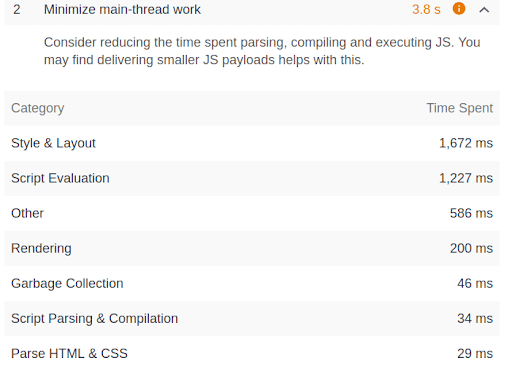
Google also finds Google’s use of the main thread for scripting and styling to fall below Google’s guidelines:
A Fairy Tale Ending
So, should you use AMP Stories for your own content?
I wish I could say NO. But I’m going to say maybe.
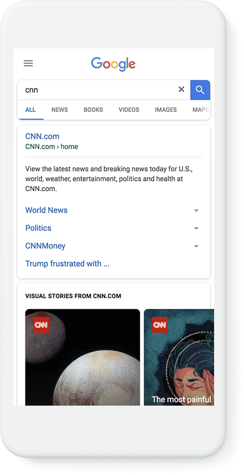
The truth is, no matter how haphazard this feature is, and how rushed it was, Google is giving it heavy priority in search results. Really heavy:
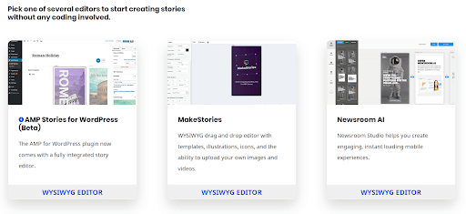
Additionally, it’s extremely easy to create AMP Stories with point-and-click editors:
In my opinion, if you know the (severe) limitations of this format, you can work around them to deliver something that could still have value to your users. And doing so can have extreme value to you, as you can get a coveted “position 0” in search results.
What I would do is this – make a simple, short AMP story that will load fast despite the poor optimization. Once you get people to your story, lead them into more reasonably-formatted content on your mobile site proper.
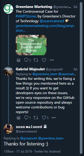
Update: After Greenlane’s Twitter account shared this article, a representative from Google responded (below). It’s wonderful to see how responsive Google is being here: