
The Hidden Psychology Behind Brand Design
When most people think about branding, they think about logos, colors, and a sleek website. But what often gets overlooked is why certain brands feel trustworthy or memorable, vs the brands that just don’t.
The difference isn’t just all aesthetics. It’s psychology.
I recently read the book Graphic Design for Everyone. In it, the author Cath Caldwell breaks down design principles in a way that’s accessible to non-designers. And while the book is positioned as a foundational guide, it reveals something deeper: the most effective brand design choices are rooted in how people perceive and process information.
If your brand design is unclear, inconsistent, or visually overwhelming, it creates friction, both for real people and search engines trying to serve you. And friction leads to hesitation, or worse, site abandonment.
On the flip side, when design is intentional and grounded in proven principles, it creates a sense of ease. Users don’t have to think as hard, which makes them more likely to engage.
In this blog, I’m talking about some of the most important elements of a brand’s design and some considerations that a lot of companies can easily overlook when posting on-site and beyond.
Color: More Than Just a Visual Preference
Color is often one of the first things businesses choose when building a brand — and one of the most misunderstood.
It’s not just about picking something that “looks good.” Color carries emotional and psychological weight. It influences how people feel about your brand before they’ve interacted with your product or service.
For example:
- Blues often convey trust, stability, and professionalism
- Reds can evoke urgency, passion, or excitement
- Greens are frequently associated with growth, health, or sustainability
But color symbolism goes deeper than these high-level associations.
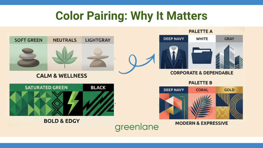
In The Complete Color Harmony, Pantone Edition, Leatrice Eiseman — executive director of the Pantone Color Institute — explores how color works not just individually, but in combination. The meaning of a color can shift dramatically depending on the palette surrounding it.
For instance:
- A deep navy paired with white and gray feels corporate and dependable
- The same navy paired with coral or gold can feel more modern and expressive
- A soft green alongside neutrals may signal calm and wellness, while a highly saturated green with black can feel bold or even edgy
This is where many brands fall short. They choose a primary color with intention, but fail to build a cohesive palette that supports it. Without that supporting system, the emotional signal becomes inconsistent — or worse, confusing.
The Role of Color Harmony
Color harmony plays a critical role here. Balanced palettes — whether complementary, analogous, or monochromatic — create a sense of visual order. And that order matters more than you might think.
From a psychological standpoint, humans are naturally drawn to patterns and cohesion. When colors feel balanced, the brain processes them more easily, creating a sense of comfort and trust. When they clash or feel disjointed, it introduces subtle tension — even if the viewer can’t articulate why.
There’s also a cultural and contextual layer to consider. Colors don’t exist in a vacuum. Their meanings can shift based on industry norms, audience expectations, and even trends. A bold neon palette might feel innovative in a tech startup context, but out of place for a financial services brand where stability and trust are paramount.
Just remember, color isn’t just decoration. It’s a signal. When used strategically, it can communicate your brand’s personality and positioning instantly.
Symbolism in Brand Archetypes
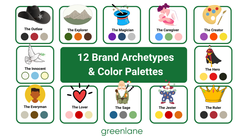
Color becomes even more powerful when it’s aligned with your brand archetype — the underlying personality your brand embodies. Archetypes give structure to how a brand should feel, and color helps communicate that feeling instantly, often before a customer reads a single word.
For example, a brand rooted in the “Caregiver” archetype will often lean into calming tones — think soft blues, compassionate pinks, or gentle greens — to evoke trust, softening, and safety. On the other hand, a “Rebel” brand might embrace high-contrast palettes, bold reds, or unexpected color pairings to signal disruption and nonconformity. These choices aren’t random; they reinforce the emotional cues that define how the brand shows up in the world.
This is where color symbolism and psychology intersect with strategy. It’s not just about choosing a palette that looks cohesive; it’s about choosing one that fits.
A mismatch between color and archetype can create confusion. Imagine a luxury brand (often aligned with the “Ruler” archetype) using overly playful, saturated colors — it may undermine the sense of authority and exclusivity it’s trying to convey. Similarly, a “Creator” brand that plays it too safe with neutral tones might struggle to communicate originality or imagination.
What’s often overlooked is that archetypes don’t rely on a single color, but on a system that consistently reinforces their identity. A “Hero” brand, for instance, might use strong, bold colors supported by high contrast and sharp visual hierarchy to convey action and confidence. A “Innocent” brand, by contrast, might rely on light, airy palettes with plenty of white space to create a sense of simplicity and optimism.
When color is aligned with archetype, it creates a kind of visual shorthand. Your audience doesn’t have to figure out who you are: they feel it immediately.
Download our free Discover Your Brand Archetype E-book, which can help you unmask your brand personality!
Typography: Your Brand’s Tone of Voice (Without Saying a Word)
If color sets the mood, typography defines the voice.
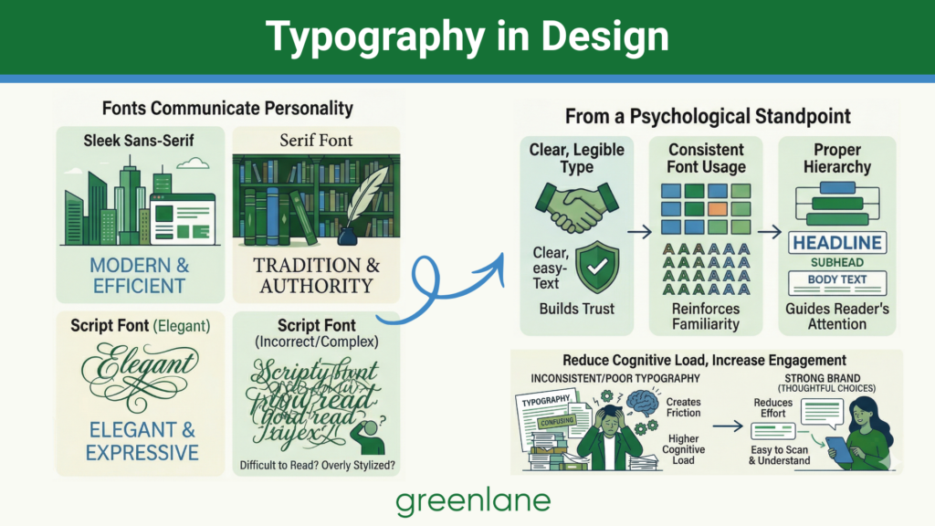
Fonts communicate brand personality. A sleek sans-serif might feel modern and efficient, while a serif font can suggest tradition and authority. Script fonts may feel elegant or expressive, but used incorrectly, they can also feel difficult to read or overly stylized.
The key takeaway isn’t just choosing the “right” font — it’s understanding how typography impacts readability and perception.
From a psychological standpoint:
- Clear, legible type builds trust
- Consistent font usage reinforces familiarity
- Proper hierarchy (headlines, subheads, body text) guides the reader’s attention
When typography is inconsistent or poorly structured, users have to work harder to process information. That cognitive load creates friction, which can negatively impact how your brand is perceived.
Strong brands reduce that effort. They make content easy to scan, easy to understand, and easy to engage with — all through thoughtful typographic choices.
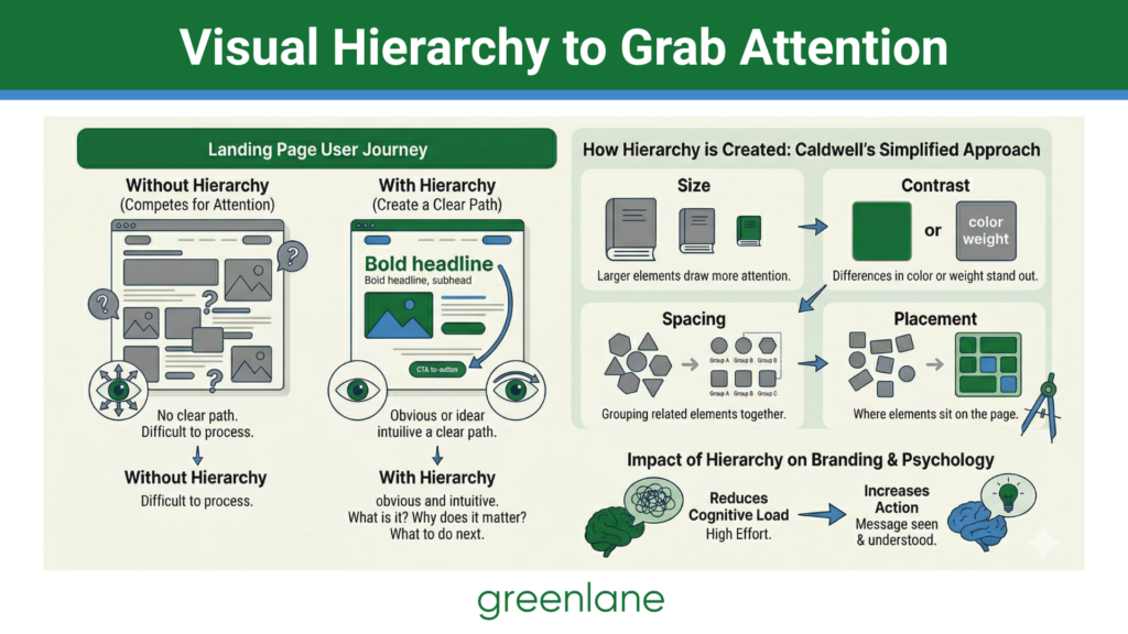
Visual Hierarchy: Guiding the User Journey
One of the most practical — and powerful — concepts emphasized in foundational design is visual hierarchy. In simple terms, it’s how you organize elements on a page to guide the viewer’s eye.
Without hierarchy, everything competes for attention. With it, you create a clear path. People are more likely to take action when the next step feels obvious and intuitive.
Hierarchy is created through:
- Size (larger elements draw more attention)
- Contrast (differences in color or weight stand out)
- Spacing (grouping related elements together)
- Placement (where elements sit on the page)
Consistency: The Foundation of Brand Trust
If there’s one thread that ties all of these elements together, it’s consistency.
A brand that changes its colors, fonts, or layout style from one touchpoint to the next doesn’t just look disorganized — it feels unreliable. And in a competitive market, trust is everything.
Consistency works because of a psychological principle known as the “mere exposure effect.” The more people encounter something familiar, the more they tend to trust it.
That’s why the strongest brands don’t reinvent themselves with every campaign. They build repeatable, recognizable design patterns that reinforce their identity over time. This is where many businesses struggle. They may understand design fundamentals individually, but without a cohesive system, their brand still feels fragmented.
Ready to Turn Design Principles Into a Stronger Brand?
Understanding the psychology behind design is a powerful first step. But turning those insights into a strong brand takes more than theory — it takes application.
If your brand feels inconsistent, unclear, or just not as impactful as it could be, it may not need a complete overhaul. It may just need a more strategic approach to design. Download our free Brand Personalities Guide to see which archetype belongs to your brand and start thinking more about color theory in web design and beyond.
Download Our Free Brand Personalities Guide
A form for the Brand Personalities Guide
At Greenlane Marketing, we can help you stay consistent in your website content. From defining your visual identity to ensuring consistency across every marketing channel, our team works closely with you to create a brand that not only looks great but also performs. Explore our Branding Services to see how we can help you build a brand that resonates and delivers results.