

Forecasting Search Marketing Success with a Click Curve
Wouldn’t SEO be much easier if there was a way to predict just how much a change in a page’s SERP rankings would impact the amount of traffic that page gets? While the “opportunity score” formula isn’t new, we wanted to share the one we prefer – and show you how to make your own. This is our homegrown Click Curve.
What is It?
A Click Curve can help you estimate increases or decreases in a page’s traffic based on the overall site’s keyword rankings or positions and clickthrough rates (CTR). It works by plotting the site’s keyword rankings and CTR in a scatterplot, adding a line of best fit to the data points and calculating the equation of the trendline to help you determine the estimated change in traffic or CTR with a gain or loss in rank. It provides directional information to support your campaign planning.
Does It Work for Everyone?
Unfortunately, not as well for low traffic sites. The data becomes much less valid with lower traffic numbers. You’ll want to use the Click Curve on sites that have high volume and high traffic. This is because you need a statistically significant data set to work with to ensure that this isn’t all thrown together by chance.
How Do You Do It?
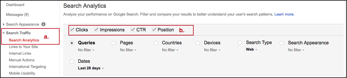
- Gather your rankings data from Search Console:
– Click on Search Traffic, then Search Analytics
– Make sure the boxes for Clicks, Impressions, CTR, and Position are all checked
– Filter out branded terms like these will most likely have higher rankings and CTRs and will skew the data. your rankings data from Search Console:
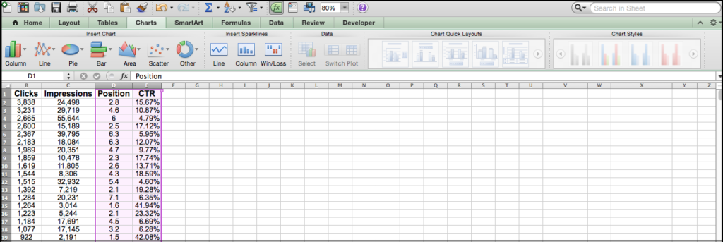
- Export the data and open in Excel
- Filter out additional branded terms (e.g. misspellings)
- Create a scatter plot of the data (Disclaimer: I’m using the Mac version of Excel, so if you’re using the PC version these steps are probably a little different.)
- Select the columns containing the Position and CTR data the data and open in Excel
-
-
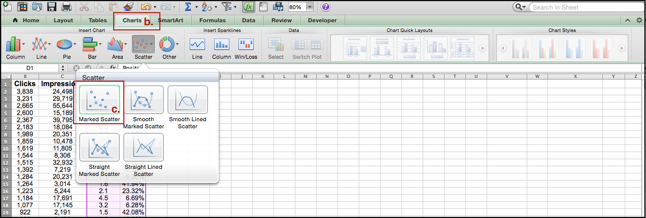
- Select the Charts tab
- Under “Insert Chart” select Scatter > Marked Scatter
- Note: Depending on the range of positions your keywords are ranking for, you may have to change the scale of your x-axis to make it easier to view the chart.
-

-
-
-
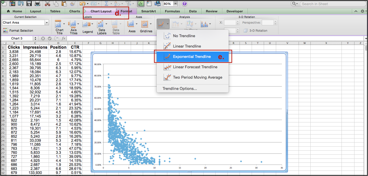
- Select the Chart Layout tab
- Under “Analysis” click Trendline > Exponential Trendline (this is your Click Curve)
-
-

-
-
-
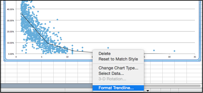
- Right-click the trendline on the scatterplot and select Format Trendline
-
-
-
-
-
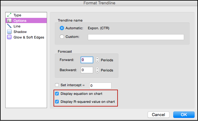
- In the Options menu, Check the boxes next to “Display equation on chart” and “Display R-squared value on chart”
-
-
-
- Select the columns containing the Position and CTR data the data and open in Excel

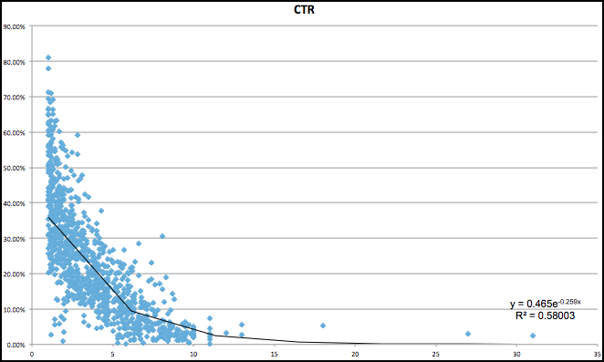
And that should give you a graph that looks something like this:
[su_newsletter_email]
Now you’re going to want to do a little analysis and try to remember everything you learned in your last statistics class. The R-squared value is a statistical measure that tells you how well your data fits the trendline. You’re typically aiming for an R-squared value above .95 since that means the trendline is an almost perfect fit for your data points, but anything around or above .6 is usually good to work with.
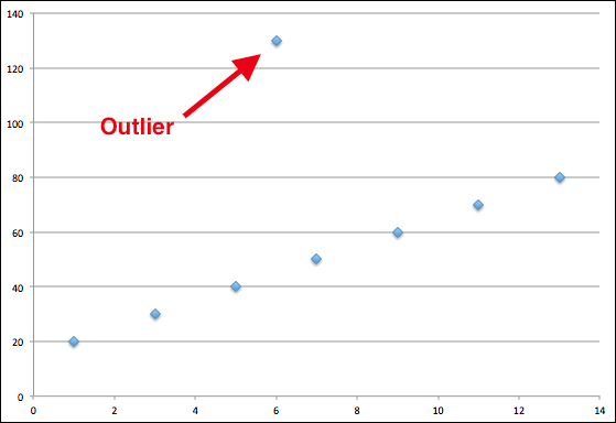
If your R-squared value is low, you’ll want to check your data set to make sure you didn’t miss any outliers, abnormal data points that are typically far removed from the core dataset as shown in the example below. The official definition of an outlier is anything that is 1.5 quartiles outside of the key three quartiles, but Krista Park, our Director of Analytics, prefers the Kevin Bacon method: any data points more than five degrees from (or five times greater than) the median are outliers.
Once you have a decent R-squared value, congrats! Now you can start working with the equation that was generated for the Click Curve. In this example, we were given the equation y=0.465e-.259x, where:
- y is equal to CTR
- e is a mathematical constant equal to 2.71828
- x is equal to Position
You can plug values into x to estimate CTR at any given rank. This Excel formula will help you take care of the exponent: =POWER(number,power) where:
![]()
- “number” is the base number
- “power” is the power you want to raise it to
The entire Excel function that we would use to calculate CTR for a Position equal to6 in this example would look like this: =0.465*POWER(2.71828,-.259*6).
You can also create a table that lists rank from 1 to 20 (or any max Position you want) in one column and the equation formula in another. This way instead of inserting each rank into the equation, you can simply select the corresponding cell and drag the formula down to auto-populate the estimated CTR. This will help you figure out how the CTR might change with a gain or loss in rank. You can also take this a step further and estimate how much traffic will be gained or lost by multiplying the estimated CTR by a keyword’s search volume. You can estimate how much revenue might be gained or lost depending on traffic as well!
What Can I Use This For?
As we already covered, you can use the Click Curve to estimate the effect a change in rankings will have on traffic to your site, but what are some more specific cases where a Click Curve can help you out? Here are a few:
1. Paid Search vs. Organic Search Analysis: If you have keywords that you are targeting with both paid and organic search, you can compare the click curves of both instances of the keywords to see how well they are performing against each other. You can compare the paid and organic Click Curves to determine how you can expect an organic keyword to perform on a page with a paid search result versus without.
For example, in a similar analysis of one of our clients, we noticed that on SERPs where they had both a paid and organic result for a keyword, the paid keyword almost always had a higher CTR than the organic keyword.
2. ROI Analysis: Say you have a client who decides that instead of spending their time and money focusing on pursuing keywords, they would rather spend their resources on some other form of advertisement. Using a Click Curve and additional data, such as revenue or proxy values for keyword positions, you will be able to show your client how much potential traffic and revenue they could lose if their keywords drop from their current positions to lower ones because of the focus shift.
3. Keyword Prioritization: If your client only wants to focus on a few specific keywords, you can use a Click Curve to show them whether or not those terms will be worth the effort. The Click Curve will help you determine whether or not focusing on those particular terms will produce as much potential traffic and revenue as focusing on other broader terms might.
And there you have it – an easy way to forecast the effect keyword rankings will have on a few different areas of a business. You won’t always know exactly how a keyword’s rankings might change, but using the Click Curve can help you prepare for anything that might happen.
Follow the @greenlane_team on Twitter for more helpful SEO articles.