10 Proven Best Practices for Landing Page CRO Improvement
In a world where ad costs are rising and attention spans are shrinking, landing pages remain one of the most powerful tools in your paid marketing toolkit. But it’s not just for PPC campaigns; organic-ranking landing pages compete with AI-ridden SERPs now more than ever.
But having a strategically optimized landing page (LP) can make a HUGE difference in your marketing success. Studies show that landing pages can convert at an average rate of 10–11% across industries (well above other conversion strategies!). Not to mention that A/B testing these pages after launch can boost results by 30% or more with mindful iterations.
At Greenlane Marketing, we’ve found that not all our new clients follow landing page best practices for optimal conversion rate. However, there are CRO strategies that consistently work for improving our clients’ landing page performance, and we had the whole team discussing them on a recent call.
Stop wasting ad spend. Start optimizing for real profit.
Our PPC experts will help you squeeze more ROI out of every click—starting today.
I’ve distilled a decade of landing page creation expertise into ten must-have tactics to help you convert paid or organic traffic immediately:
1. Start the Landing Page with Clarity & Consistency
GET TO THE POINT. Sure, we all have our reasons for wanting to have long copy on a landing page, especially if we want it to rank organically. But long-winded copywriting puts our brains on snooze.
If people come to your site and can’t figure out what you want them to do (and why they should) or who you’re even talking to, they’re not going to convert.
Instead, every heading, bullet, and image should be concise and focused, reinforcing the next step: conversion. You must clearly communicate what you want users to do and what they’ll receive in return when they complete your form or take an action on the page.
Short, sweet, skimmable, actionable. This clarity reduces cognitive friction during decision-making, helping the visitor focus on one task: your CTA. It’s not just marketing softness — the data backs it. Landing pages with consistent messaging from ad to page can improve conversion by as much as 50%. That stat alone was just viewing it through a paid media lens, too!
2. Optimize for Mobile, Not Just Desktop (Obviously… But Needs to Be Said)
Ensuring mobile usability in today’s day and age shouldn’t be an afterthought; it’s the foundation.
Here in 2025, mobile accounts for roughly 83% of all landing page visits, but mobile traffic still converts at around 1.8% — compared to 3.9% on desktop. That gap underscores the importance of a proper mobile-first strategy, not just responsive design (a term that SEOs have beaten to death recently). Mobile-first landing page optimization isn’t just about designing flexible webpage layouts for phone or tablet users.
It also means:
- Streamlined forms that don’t ask for too much information
- Touch-friendly buttons that don’t need to be pinched and zoomed
- Single-column layouts that don’t require sideways scrolling
- Fast-loading images and pages that don’t make users wait more than a second or two
- And the elimination of navigation menus, which can steal attention from your ultimate goal of filling out a form or taking your preferred action on that landing page
It also means testing on real devices. These slow-loading images, tiny CTAs, or misaligned fields frustrate users and inflate bounce rates. A 1-second loading time versus 5 seconds can lead to a higher conversion rate, and I don’t need a source to convince you of that.
3. Write Copy That’s Benefit‑Driven & Persuasive
Users don’t care about your company until they see how you solve their problem. The worst thing I see time and time again is clients touting their brand, but not leading with the desires of the customers. No offense, but no one cares about your brand unless it solves a problem for them.
The best landing pages lead with what matters to the reader: benefits, transformations, and outcomes. It’s not a brand name’s competitive advantages/benefits spotlight.
With that in mind, we recommend:
- Keeping copy tight, scannable, and user-centric
- Speaking directly to user intent: “You’re here because you want X, so this is how we help.”
- Remembering that every sentence should justify your ask: payment info, form fill, download, etc.
- Using bold subheads, bullets, and emphasis to help readers skim and absorb quickly
- Avoiding industry jargon that the audience won’t understand
- Using urgency, social proof snippets, and customer pain reversal tactics to increase perceived value
- Closing with the clear, promise-driven CTA
4. Prioritize User Experience (UX)
UX includes everything from intuitive flow and accessible design to credible visual structure.
What’s a good user experience for a landing page? The short answer is this: good UX on a landing page removes any barriers to conversion.
Perhaps most importantly, it eliminates confusion or frustration. Regarding the mobile-friendly point, if someone has to zoom in 3x on their phone to fill out your form and the text pad keeps minimizing, they’re going to give up and promptly bounce back. Similarly, if the colors are hard to read or the buttons don’t work, your conversions are at risk.
Tools like Google Analytics, as well as heatmap tracking and session recording software, can help identify which elements create friction: whether forms are abandoned, scroll depth is low, or CTA clicks are rare.
Good UX doesn’t just help first-time visitors — it supports A/B and multivariate testing frameworks to refine page performance continuously.
5. Keep CTAs Eye Catching & Action‑Oriented
Your call to action is the specific action you want someone to take when viewing the landing page.
I say “the action” because it needs to be a single thing you ask of them. Data shows that multi-CTA pages fall short on conversions. In contrast, only using a single CTA typically converts at about 13.5%.
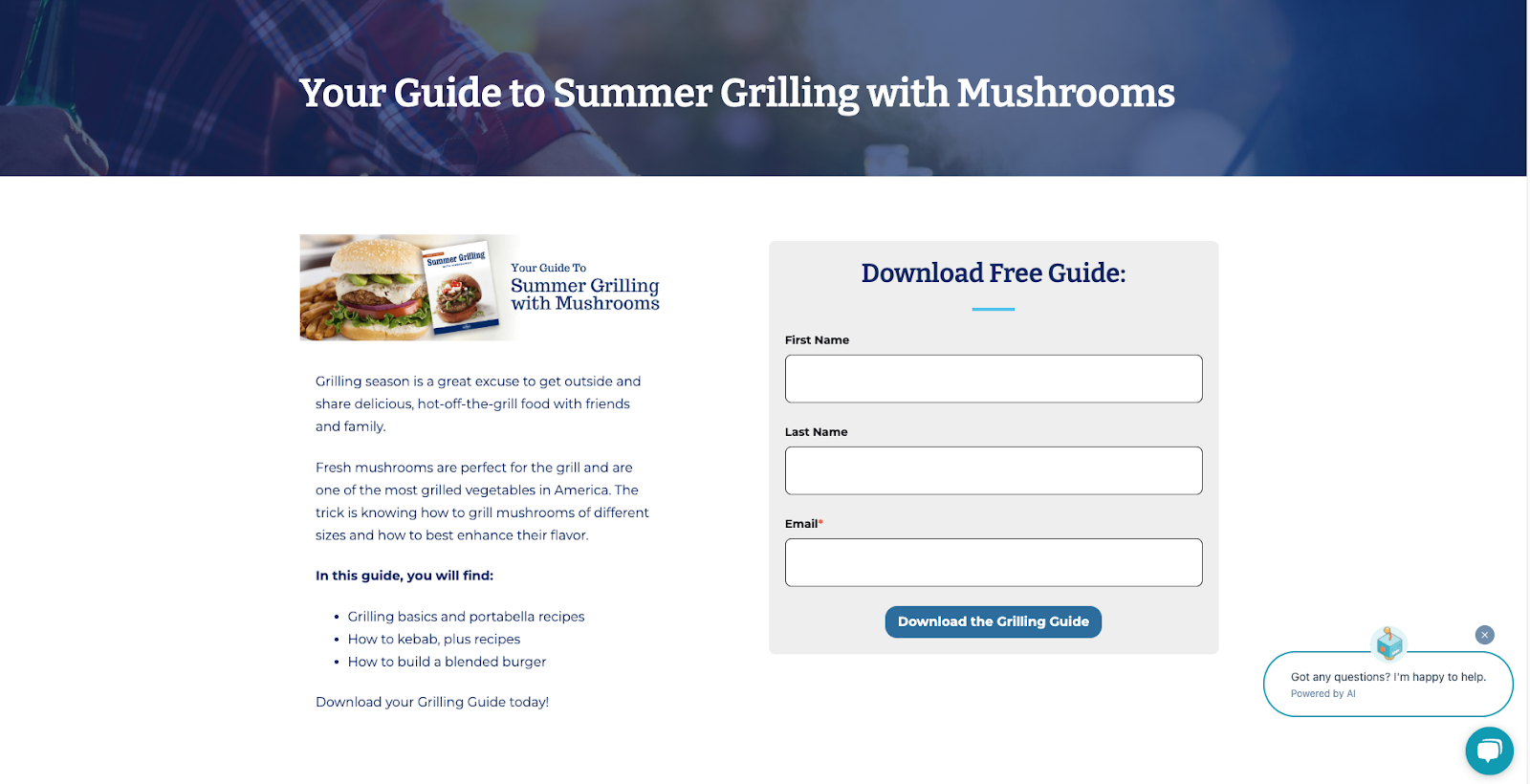
Here’s an example of a high-converting landing page for a past client of mine, where their call-to-action to download their Summer Grilling Guide is forward and using action-oriented language in the button: “Download the Grilling Guide.”

Eye-Catching Landing Page CTA Example from Monterey Mushrooms
Distraction-filled landing pages will always fall short on conversions and form fills. You want to tell them exactly what they’ll get and keep them focused on the action.
To make that one CTA stand out, here are a few things to keep in mind:
- Position your CTA above the fold. For a scrolling page, repeat it naturally below supporting content
- Use bold buttons with on-brand color contrast
- Choose verb-first but straightforward, action-oriented language like “Download the Guide” or “Schedule a Demo.” (not just “Submit.”)
- Use directional cues to draw attention to the button, like arrows, whitespace, and headlines
6. Use Gated Content (Wisely)
We all have limits to how much personal information we’re willing to give away to a brand we’re just exposed to for the first time. If we see something we really want that’s gated behind a form, that piece of content better be worth what we’re willing to share…
In other words, how much we’re willing to trade often aligns with how much info or how valuable we deem the info we receive in exchange. For example, a landing page offering high-value content (ebooks, whitepapers, case studies) that only asks for 2–3 form fields, such as your name, email, and an unobtrusive question like your job title that anyone could find searching LinkedIn, isn’t that big of a deal to most users.
For example, here’s a landing page from a past client that gated their Tandem Skydiving Guide. However, we gave the user a sneak peek into the chapters of the ebook, and we only required their name and email to access it. Had we requested more information in the form or been vague about the offering, conversions would likely have been lower.
Example of Gated Content Landing Page from Chicagoland Skydiving Center
The average conversion rate of this type of content on a gated landing page is around 10%, which is pretty good. But if you get greedy and ask for too much in exchange for your offer, you’ll have a fat chance of getting that lead.
If you’re going to take anything away from this section, use fewer fields for low-value content and only use more than 3 fields for higher-value, interactive offers like webinars.
7. Build Trust with Social Proof
Trust elements reassure visitors at a glance; they tell a landing page visitor that others have trusted you in the past, therefore, they can trust you too.
Testimonials, case studies, star ratings, and secure checkout badges all reduce perceived risk.
So how can you reduce users abandoning landing pages before engaging with offers? By prominently placing user success stories directly next to CTAs.
Include quantified results wherever possible. For example, we “doubled conversion rates,” clients saw a “$X revenue uplift.” Also include logos of known clients, certifications (SSL, privacy seals), and real‑user quotes to reduce anxiety.
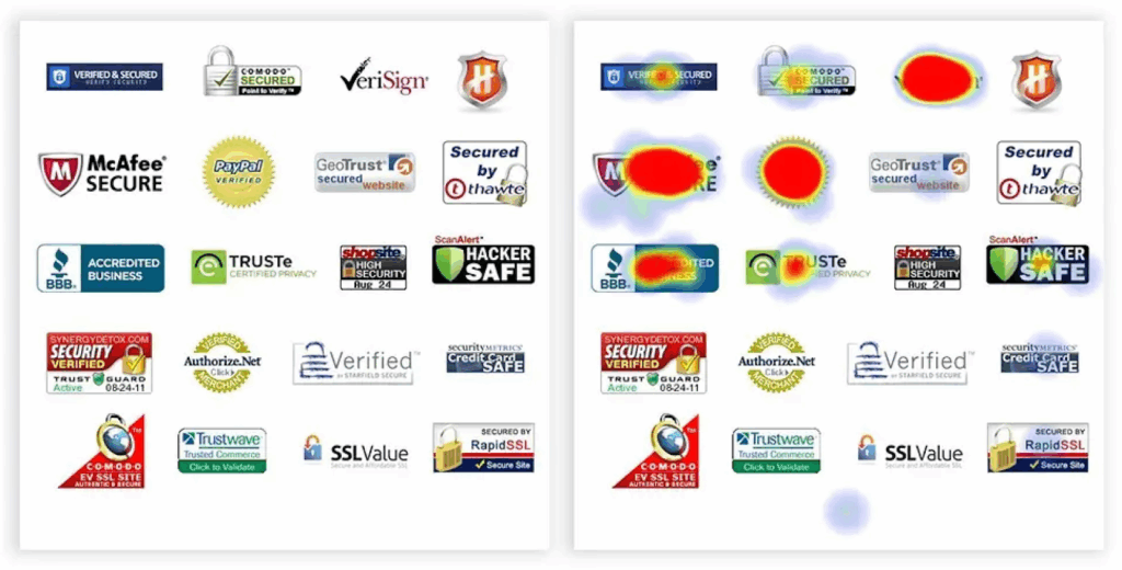
Trust badges near forms or checkout buttons deliver the strongest impact. Here’s an example below to show how one site used a large list of badges on its page. They used heat map tracking (depicted on the right) to show in red which trust signal logos were hovered over or clicked the most. This is a great instance to push the importance of tracking and testing your landing page’s performance and making adjustments not only to improve CRO, but also to give your user exactly what they’re looking for. In another landing page, this company may choose to only highly their top six trust badges instead of the twenty-five they originally launched with.

Example from Yieldify of Badges
Additionally, testimonials with photos and real names outperform anonymous quotes. This builds the implicit assurance needed to justify clicking or form fills.
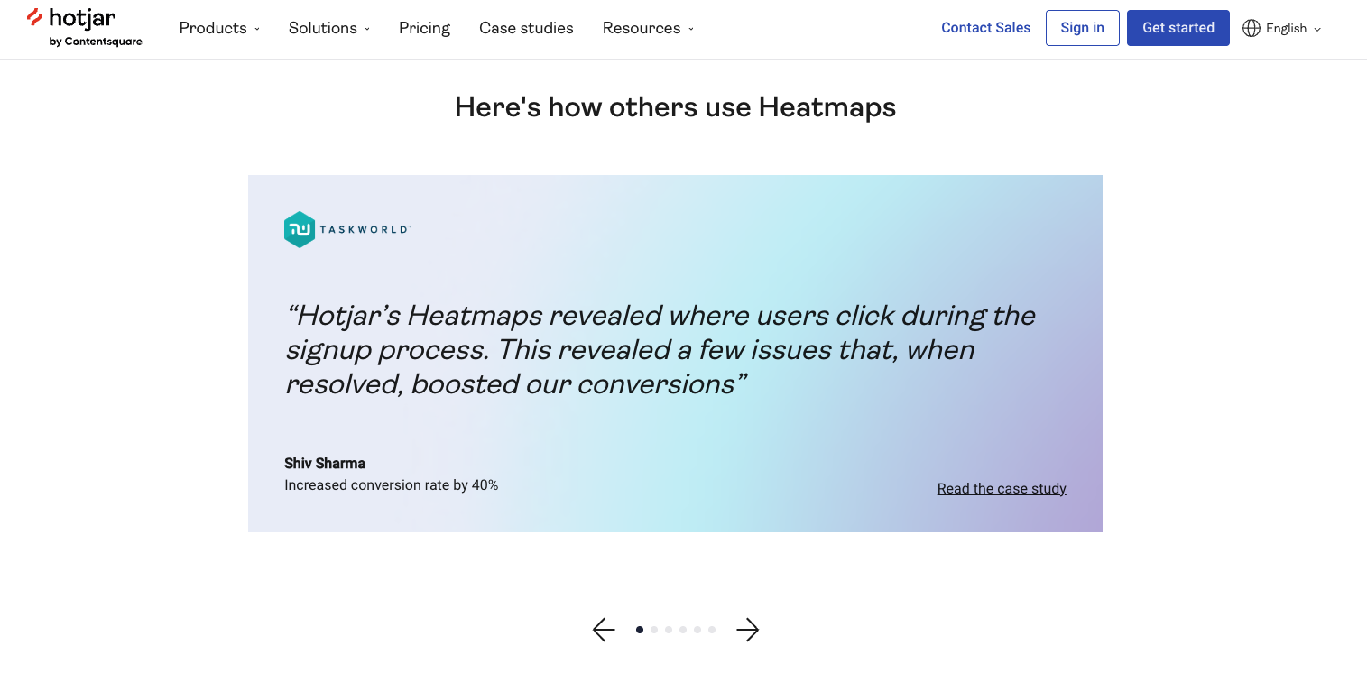
Here’s an example of a product page on Hotjar that’s not exactly what you’d think of for a traditional landing page, per se; however, they make good use of showing testimonials as you’re exploring more about heatmaps.

Testimonial Page Examples from Hotjar
8. Personalize Carefully with Dynamic Content
Personalization can boost engagement — but when executed poorly, it can harm SEO and trigger cloaking flags. When discussing this topic with my team, our SEO Lead, Dylan, warned: “If content disappears based on behavior, Google may see it as cloaking.”
Instead, tailor messaging based on user location, device, or search query in a way that is visible to bots.
Use dynamic text replacements (e.g., “[City] business owner”) or tailored offers — for example, mid‑page CTAs that change based on traffic source.
Regardless, test carefully to ensure that personalization enhances both user metrics and overall page performance.
9. Don’t Forget About Page Speed
Every extra second of load time harms conversion. Pages that load within 1 second convert up to 3× better than those taking 5 seconds. Even a 1-second delay can reduce conversions by up to 7%.
Some important things to keep in mind as it relates to optimizing landing pages for page speed:
- Mobile users expect instant access.
- Optimize/compress images
- Minimize scripts
- Defer non‑critical CSS
- Use caching
- Limit redirects
- Regularly monitor performance via tools like Lighthouse or Google PageSpeed Insights
These performance factors aren’t optional when it comes to following landing page best practices for CRO. It directly affects user satisfaction, bounce rate, and ultimately, revenue.
10. Always Iterate, Test, & Optimize
Landing page improvement isn’t a one‑and‑done task. At Greenlane, we work in cycles: test, analyze, refine, repeat.
Even something seemingly simple like an accidentally visible navigation menu could dramatically decrease CRO. That exact use case was responsible for killing conversions for a past client of mine, which was only discovered through testing.
Use multivariate testing, heatmaps, and analytics to guide decisions.
Even small tweaks such as strategically chosen headlines, ADA-compliant and brand-consistent button colors, or form field modifications, can sometimes yield 10–30% conversion gains.
Landing Page CRO Improvement with Greenlane
Whether you’re driving paid or organic traffic — or both — this toolkit ensures your landing pages are working hard for your lead goals. Conversion improvement is a constant process, not an event.
If you’re looking to elevate paid or organic campaigns with high-converting landing pages, our optimization services are designed to deliver results. From strategy and copywriting to testing and analytics, we’ve got you covered.
Explore our Conversion Rate Optimization Services.


